The "Polymer 3.0 preview" article translated into Spanish.
Polymer 2.0
Unlock the Power of Web Components. Polymer is a JavaScript library that helps you create custom reusable HTML elements, and use them to build performant, maintainable apps.
Polymer Summit 2017

Join us in Copenhagen for the third annual Polymer Summit, August 22–23, 2017. The summit will feature talks from the Polymer team and community, codelabs, and of course great food and fun! Registration is open!
Visit the SiteCan't wait? Watch videos from last year's Summit in London.
WatchPolymer library
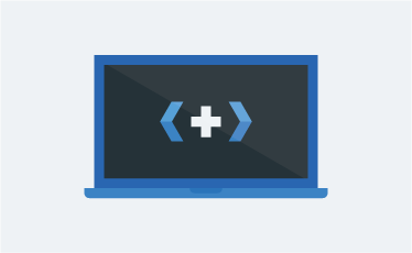
Polymer is a lightweight library that helps you take full advantage of Web Components.
With Web Components, you can create reusable custom elements that interoperate seamlessly with the browser’s built-in elements, or break your app up into right-sized components, making your code cleaner and less expensive to maintain.
Polymer sprinkles a bit of sugar over the standard Web Components APIs, making it easier for you to get great results.
Polymer App Toolbox
Polymer App Toolbox helps you build and deliver cutting-edge Progressive Web Apps with minimal overhead and payload, by leveraging powerful web platform features like Web Components, Service Worker and HTTP/2.
The Toolbox provides a component-based architecture, responsive layouts, a modular router, localization support, turnkey support for local storage and offline caching, and efficient delivery of unbundled app resources. Adopt these features individually, or use them together to build a full-featured Progressive Web App.

Built for speed
Because they let the platform do the heavy lifting, elements built with the Polymer library and apps built with the App Toolbox are blazing fast.
For today and beyond
Polymer makes the most of the web platform by using the latest APIs. Polyfills provide support on evergreen browsers for APIs that aren't universal yet.
Fully interoperable
Polymer-powered elements are based on standard Web Components APIs, so they work seamlessly with the browser's built-in elements and other Web Components.
Use elements from the catalog
  <!-- Polyfill Web Components support for older browsers -->
  <script src="components/webcomponentsjs/webcomponents-lite.min.js"></script>

  <!-- Import element -->
  <link rel="import" href="components/google-map/google-map.html">

  <!-- Use element -->
  <google-map latitude="37.790" longitude="-122.390"></google-map>
An element built with Polymer looks and works just like any other HTML element. Simply find an element you’d like to use in your app, import it with an HTML import, and then add the tag to your page.
Browse elementsCreate your own elements
  <dom-module id="contact-card">
    <template>
      <style>...</style>
      <slot></slot>
      <iron-icon icon="star" hidden$="{{!starred}}"></iron-icon>
    </template>
    <script>
      class ContactCard extends Polymer.Element {
        static get is() { return "contact-card"; }
        static get properties() {
          return {
            starred: { type: Boolean, value: true }
          }
        }
      }
      customElements.define(ContactCard.is, ContactCard);
    </script>
  </dom-module>
  <contact-card starred>
    <img src="profile.jpg" alt="Eric's photo">
    <span>Eric Bidelman</span>
  </contact-card>
The Polymer library makes it easy to create your own powerful elements. Give your element some markup and properties, and then use it on a site. Polymer provides useful features like templating and data binding to reduce the amount of boilerplate you need to write.
Build an elementBuild Progressive Web Apps
  <iron-pages role="main" selected="[[page]]" attr-for-selected="name" selected-attribute="visible">
    <!-- home view -->
    <shop-home name="home" categories="[[categories]]"></shop-home>

    <!-- list view of items in a category -->
    <shop-list name="list" route="[[subroute]]" offline="[[offline]]"></shop-list>

    <!-- detail view of one item -->
    <shop-detail name="detail" route="[[subroute]]" offline="[[offline]]"></shop-detail>

    <!-- cart view -->
    <shop-cart name="cart" cart="[[cart]]" total="[[total]]"></shop-cart>

    <!-- checkout view -->
    <shop-checkout
        name="checkout"
        cart="[[cart]]"
        total="[[total]]"
        route="{{subroute}}"></shop-checkout>
  </iron-pages>
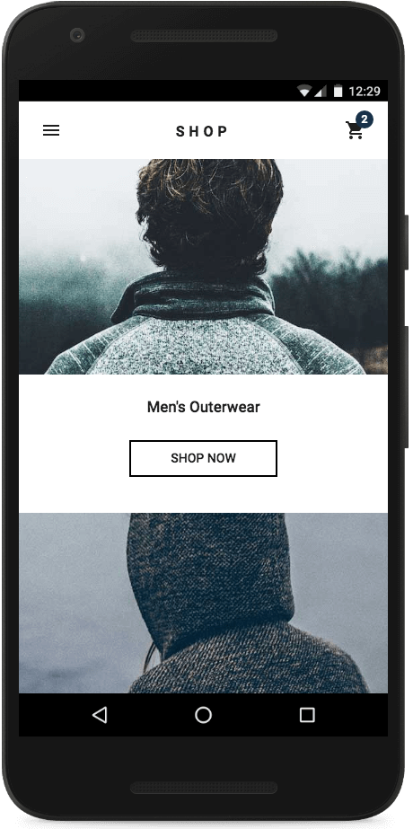
Use the Polymer App Toolbox to build super-powered Progressive Web Apps. Try the Shop demo app to experience a Progressive Web App in action.
Try the demo Build an appWho's Using Polymer


Latest news
Preview de Polymer 3.0: npm y Módulos de ES6
Polymer Summit Speaker Spotlight: Bede Overend, Simpla
Bede Overend of Simpla on facilitating engagement with Web Components.
Hands-on with the Polymer 3.0 preview
Get started experimenting with Polymer on npm and ES6 modules.
Browser Compatibility
The Polymer library and Polymer App Toolbox work in all major browsers (Chrome, Firefox, IE, Edge, Safari, and Opera).