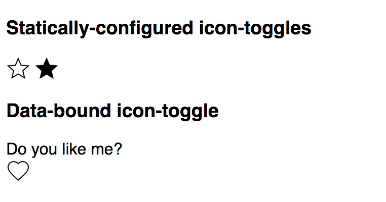
Right now, the element doesn't do much. In this step, you'll give it a basic API, allowing you to configure the icon from markup, using an attribute, or from JavaScript, using a property.
First, a bit of data binding. We'll create a toggleIcon property that you can use in HTML markup, like this:
<iron-icon icon="[[toggleIcon]]"></iron-icon>
Before this will work, we'll need to declare toggleIcon as a property.
Next, add a declaration for the toggleIcon property.
Find the script tag and add the following properties to the element's class definition:
icon-toggle.html: Before
<script>
  class IconToggle extends Polymer.Element {
    static get is() {
      return "icon-toggle";
    }
    constructor() {
      super();
    }
  }
  customElements.define(IconToggle.is, IconToggle);
</script>
icon-toggle.html: After
<script>
  class IconToggle extends Polymer.Element {
    static get is() {
    return "icon-toggle";
    }
    static get properties() {
      return {
        toggleIcon: {
          type: String
        },
      }
    }
    constructor() {
      super();
    }
  }
  customElements.define(IconToggle.is, IconToggle);
</script>
Key information:
- You must declare a property in order to use it in your HTML.
- A simple property declaration like this one just includes the type (in this
case,
String).
Learn more: deserializing attributes. The declared property type affects how Polymer converts, or deserializes
the attribute value (always a string value) into a JavaScript property value.
The default is String, so the declaration of toggleIcon is a formality here.
To learn more, see Attribute
deserialization in the Polymer docs.
Now find the <iron-icon> element and change the value of the icon attribute from "polymer" to "[[toggleIcon]]".
icon-toggle.html
<!-- local DOM goes here -->
<iron-icon icon="[[toggleIcon]]">
</iron-icon>
Key information:
-
toggleIconis a property you'll define on the toggle button element. It doesn't have a default value yet. -
The
icon="[[toggleIcon]]"assignment is a data binding. It links your element'stoggleIconproperty with the<iron-icon>'siconproperty.
You could now use your element and set the toggleIcon property in markup or
using JavaScript. If you're curious about where the new icons come from, take a look at demo-element.html in the demo folder.
You'll see lines like this:
demo-element.html—existing demo code
<icon-toggle toggle-icon="star" pressed></icon-toggle>
These lines are already in place, you don't have to add them. These lines
are part of the demo you see on screen. But if you'd like to experiment, try
adding a new <icon-toggle> element to the demo-element.html file. Some
icon names you can try are add, menu, and settings.
Learn more: attribute and property names. You'll note that the markup above
uses toggle-icon, not toggleIcon. Polymer represents camelCase property names
using dash-case attribute names. To learn more, see Property
name to attribute name mapping in the Polymer library docs.
The properties object also supports several more features. Add the following lines to add
support for the pressed property:
icon-toggle.html: Before
<script>
  class IconToggle extends Polymer.Element {
    static get is() {
    return "icon-toggle";
    }
    static get properties() {
      return {
        toggleIcon: {
          type: String
        },
      }
    }
    constructor() {
      super();
    }
  }
  customElements.define(IconToggle.is, IconToggle);
</script>
icon-toggle.html: After
<script>
  class IconToggle extends Polymer.Element {
    static get is() {
    return "icon-toggle";
    }
    static get properties() {
      return {
        pressed: {
          type: Boolean,
          notify: true,
          reflectToAttribute: true,
          value: false
        },
        toggleIcon: {
          type: String
        },
      }
    }
    constructor() {
      super();
    }
  }
  customElements.define(IconToggle.is, IconToggle);
</script>
Key information:
- For this more complicated property, you supply a configuration object with several fields.
- The
valuespecifies the property's default value. - The
notifyproperty tells Polymer to dispatch property change events when the property value changes. This lets the change be observed by other nodes. - The
reflectToAttributeproperty tells Polymer to update the corresponding attribute when the property changes. This lets you style the element using an attribute selector, likeicon-toggle[pressed].
Learn more: notify and reflectToAttribute. The notify and
reflectToAttribute properties may sound similar: they both make the element's
state visible to the outside world. reflectToAttribute makes the
state visible in the DOM tree, so that it's visible to CSS and the
querySelector methods. notify makes state changes observable outside the
element, either using JavaScript event handlers or Polymer
two-way data binding.
Now your element has pressed and toggleIcon properties working.
Reload the demo, and you should see star and heart icons instead of the hard-coded icon from the previous step:

