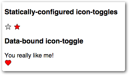
You now have a button that's basically functional. But it's stuck using the existing text color for both pressed and unpressed states. What if you want to get a little flashier?
Local DOM helps prevent users from styling your element's internals by accident. To allow users to style your component, you can use custom CSS properties. Polymer provides a custom CSS property implementation inspired by the CSS Custom Properties for Cascading Variables specification.
You apply a custom property inside your element using the var function.
background-color: var(--my-custom-property, defaultValue);Where --my-custom-property is a custom property name, always starting with two dashes (--), and defaultValue is an (optional) CSS value that's used if the custom property isn't set.
Add new custom property values
Edit your element's <style> tag and replace the existing fill and stroke
values with custom properties:
icon-toggle.html
  <style>
    /* local styles go here */
    :host {
      display: inline-block;
    }
    iron-icon {
      fill: var(--icon-toggle-color, rgba(0,0,0,0));
      stroke: var(--icon-toggle-outline-color, currentcolor);
    }
    :host([pressed]) iron-icon {
      fill: var(--icon-toggle-pressed-color, currentcolor);
    }
  </style>
Because of the default values, you can still style the <icon-toggle> just by
setting color, but now you have other options.
Open up icon-toggle-demo.html and set the new properties. (If you downloaded
the starting code, this file is in the demo folder.)
icon-toggle-demo.html
    <style>
      :host {
        font-family: sans-serif;
        --icon-toggle-color: lightgrey;
        --icon-toggle-outline-color: black;
        --icon-toggle-pressed-color: red;
      }
    </style>
Run the demo again to get colorful.

That's it — your element is finished. You've created an element that has a basic UI, API, and custom styling properties.
If you have any trouble getting the element working, check out the finished version.
If you'd like to learn a little more about custom properties, read on.
Extra credit: set custom properties at the document level
Frequently you want to define custom property values at the document level, to
set a theme for an entire application, for example. Because custom properties
aren't built into most browsers yet, you need to use a special custom-style
tag to define custom properties outside of a Polymer element. Try
adding the following code inside the <head> tag of your index.html file:
    <style is="custom-style">
      /* Define a document-wide default—will not override a :host rule in icon-toggle-demo */
      :root {
        --icon-toggle-outline-color: red;
      }
      /* Override the value specified in icon-toggle-demo */
      icon-toggle-demo {
        --icon-toggle-pressed-color: blue;
      }
      /* This rule does not work! */
      body {
        --icon-toggle-color: purple;
      }
    </style>
Key information:
-
The
:rootselector is a standard CSS selector that's equivalent to the highest level element in the document, so it's usually equivalent tohtml. In thecustom-styleelement, you need to use:root, nothtmlto specify document-wide defaults. -
The
icon-toggle-demoselector matches theicon-toggle-demoelement, and has a higher specificity than the:hostrule insideicon-toggle-demo, so it overrides the values there. -
Custom properties can only be defined in rule-sets that match the
:rootselector or a Polymer custom element. This is a limitation of the Polymer implementation of custom properties.
Run the demo again, and you'll notice that the pressed buttons are now blue, but the main color and outline color haven't changed.
The --icon-toggle-color property doesn't get set because it can't be applied
to the body tag. Try moving this rule into the icon-toggle-demo block to see
it applied.
The :root rule-set creates a document-wide default value for --icon-toggle-outline-color.
But this value is overridden by the corresponding rule inside the icon-toggle-demo
element. To see this default value at work, comment out the corresponding rule in
icon-toggle-demo.html:
icon-toggle-demo.html
    <style>
      :host {
        font-family: sans-serif;
        --icon-toggle-color: lightgrey;
        /* --icon-toggle-outline-color: black; */
        --icon-toggle-pressed-color: red;
      }
    </style>
Finally, note that to match a selector in the custom-style, the element must
be in the document scope—for example, in index.html, not inside another
element's local DOM. For example, these rules do not work inside the
custom-style:
    iron-icon {
      --iron-icon-width: 40px;
      --iron-icon-height: 40px;
    }
That's because the iron-icon elements on the page are inside another element's
local DOM. However, since custom properties inherit down the tree, you can set
these properties at the document level to set the size for all iron-icon
elements on the page:
    :root {
      --iron-icon-width: 40px;
      --iron-icon-height: 40px;
    }
Ready to get started on your own element? You can use the Polymer CLI to Create an element project.
You can also see the Build an app tutorial to get started on an app using the Polymer App Toolbox.
Or review the previous section:
Previous Step: React to input
 You're viewing an older version of Polymer.
Please see