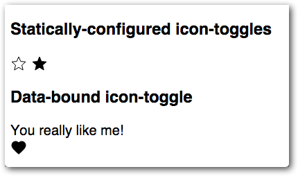
Of course, a button isn't a button if you can't click it. To toggle the button,
add an event listener. To add event listeners on the host element (in this
case, icon-toggle), add a listeners object to the element prototype:
icon-toggle.html
  Polymer({
    /* this is the element's prototype */
    is: 'icon-toggle',
    properties: {
      toggleIcon: String,
      pressed: {
        type: Boolean,
        value: false,
        notify: true,
        reflectToAttribute: true
      }
    },
    listeners: {
      'tap': 'toggle'
    },
    toggle: function() {
      this.pressed = !this.pressed;
    },
  });
Key information:
-
The
listeners objectprovides a simple way to set up event handlers. It maps event names to handler names. -
The
tapevent is generated by Polymer's gesture system when the user clicks or taps on a target with a mouse or finger. (Thelistenersobject works with built-in events likekeydownandkeyup, too.)
Save the icon-toggle.html file and look at the demo again. You should be able to press the button and see it
toggle between its pressed and unpressed states.

Learn more: data binding. To see how the demo works, open icon-toggle-demo.html
and take a look around (if you downloaded the code, you'll find this file in the demo folder.)
Yes, the demo for this element is also an element. The
element uses two-way
data binding and a computed
binding to change the string displayed when you toggle the button.

 You're viewing an older version of Polymer.
Please see